- Home
- Editorials
- Logo Design Trends for 2026
Logo Design Trends for 2026

In 2026, logos are no longer designed just to look beautiful — they are designed to survive. In a world dominated by AI-generated uniformity, shrinking attention spans, and interface-driven branding, the real challenge is not style but instant recognizability.
I no longer believe in "logo trends" in the way we used to talk about them.
Every year the same superficial conversations resurface: serifs are back, minimalism is dead, gradients are evolving. Yet none of these explain why logos look the way they do today.
What I see in 2026 is not a stylistic shift but pressure. Pressure from interfaces, from AI, from diminishing attention spans, and from the fact that logos no longer remain static.
They don’t sit quietly in brand guidelines anymore. They move, they live inside apps, they shrink into icons, they layer into flows nobody consciously notices — and yet recognition must happen instantly.
This changes the game entirely.
We are no longer designing logos — we are designing how logos break down.
The biggest shift I had to internalize is that the logo itself is no longer the final deliverable.
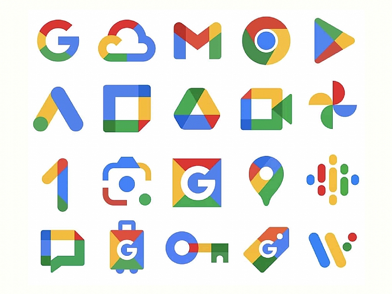
Take Google, for example. The logo still exists, but at this point it is almost symbolic. What people actually interact with is a system: the “G” icon, the color logic, the way elements move and adapt across products.
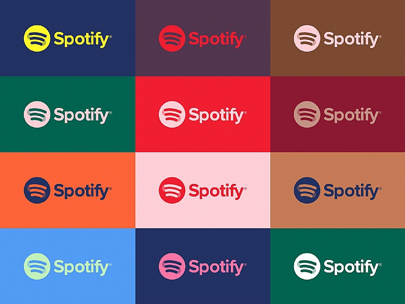
Spotify works the same way; the green circle is less a static mark and more a persistent signal embedded across experiences.
Uber, after years of iteration, arrived at something that functions not as a centerpiece but as a flexible component within an interface.
The goal is no longer simplicity — it is survivability.
For a long time, simplicity was considered the ultimate goal: reduce everything, eliminate excess, aim for clarity. Now it feels more like a side effect of something else — the ability to endure.
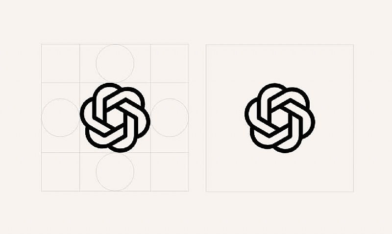
When I look at OpenAI, what strikes me is not just that the logo is simple. It also resists being fully decoded at first glance. Its geometry carries a subtle tension that lingers in your mind longer than expected.
Large-scale rebrands today feel almost irresponsible.
Once, sweeping rebrands were exciting. Now they seem risky.
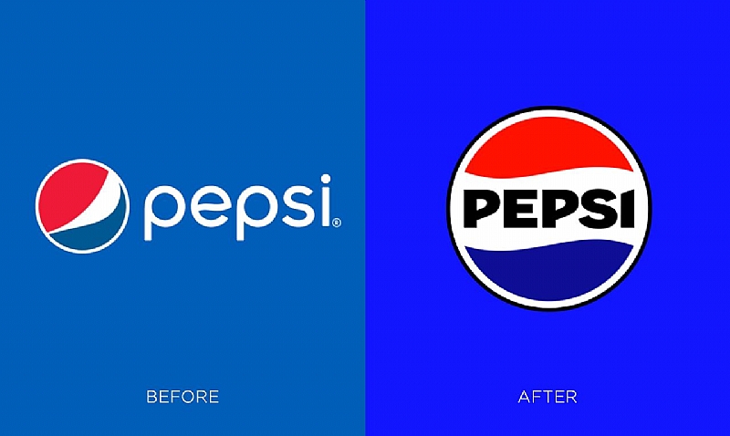
Pepsi’s latest update didn’t reinvent the brand. Instead, it leveraged its own history and adjusted its application to fit modern contexts. This wasn’t about avoiding risk — it was about understanding how fragile brand equity is in an overexposed environment. Every change is instantly scrutinized, and users have little tolerance for losing something familiar.
In practice, this means most logo work today is incremental. You don’t start from scratch; you work within an existing system and adjust it carefully.
This is a narrower problem — and in many ways, a harder one.
Typography is doing far more work than we realize.
I find myself relying on typography more than ever. Partly because icons are not always permanent. Depending on context, they get cropped, removed, or altered. But the name usually remains — especially in dense interfaces or search-driven environments.
This makes typography the most reliable carrier of identity.
Interestingly, this is not a return to generic logo design. Differentiation happens in the smallest details: subtle irregularities, slight shifts in proportion, decisions that are almost invisible at first glance but accumulate over time.
OpenAI’s updated type direction is a good example. It works within a familiar frame but avoids complete neutrality. Striking that balance is difficult. Too subtle and it disappears; too pronounced and it becomes hard to scale.
What keeps coming back to me
When I analyze everything closely, one idea keeps surfacing: today, a logo only needs a fraction of a second to be perceived. Not to be understood. Not to be liked. Simply to be recognized. And that changes the criteria entirely.